
Confessions of a Serial Overcomplicator – Or How I Built 22 Color Palettes When 2 Would Do
Confessions of a Serial Overcomplicator – Or How I Built 22 Color Palettes When 2 Would Do
October 25, 2025
My coding mentor has a favorite phrase he likes to repeat: "Marcus, you're doing it again."
He's talking about my tendency to overcomplicate things. To turn a simple task into an engineering challenge. To spend three hours perfecting something that literally no one will notice.
And you know what? He's absolutely right.
🎨 Exhibit A: The Great Palette Disaster#
Let me paint you a picture (pun intended). Most portfolios have two themes: light and dark. Simple. Clean. Sensible.
Me? I have 22 color palettes. Eleven themes, each with light and dark variants.
- Valinor (light & dark)
- Rivendell (light & dark)
- Rohan (light & dark)
- Gondor (light & dark)
- Isengard (light & dark)
- Lothlorien (light & dark)
- Erebor (light & dark)
- Fangorn (light & dark)
- Moria (light & dark)
- Edoras (light & dark)
- Weathertop (light & dark)
Yes, they're all Tolkien-themed. Yes, I spent way too much time on this. No, I don't regret it. (Okay, maybe a little.)
The Problem#
Every time I build a new component, I have to test it across all 22 palettes. Every color choice, every gradient, every hover state needs to work in Valinor's ethereal purples AND Moria's dark grays AND Rohan's earthy greens.
It's exhausting. It's time-consuming. It's completely unnecessary.
And yet... I can't bring myself to remove any of them.
🤔 Why Do I Do This?#
My mentor asks me this all the time. "Why not just pick two good palettes and move on?"
The honest answer? I don't know.
Maybe it's perfectionism. Maybe it's indecision. Maybe I just really like making my life harder than it needs to be.
But here's the thing: I'm learning to embrace it.
Sure, some palettes are better than others. Valinor is gorgeous. Moria has some contrast issues I'm not thrilled about. Weathertop could use some tweaking.
But they're mine. I built them. I tested them. I obsessed over them.
And honestly? The process taught me more about color theory, accessibility, and CSS variables than any tutorial ever could.
🛠️ The Origin Story: Theme Advisor#
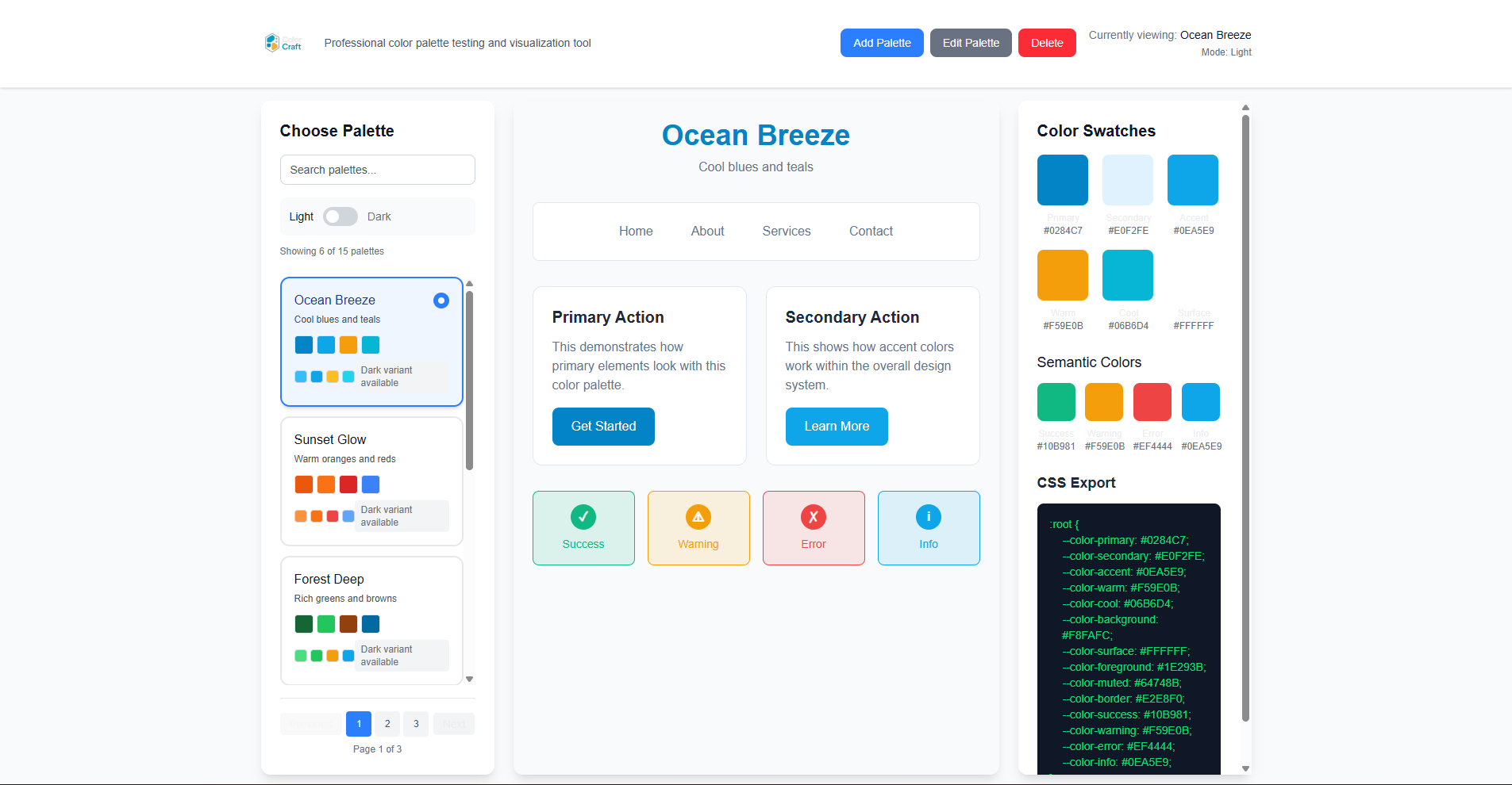
This whole palette obsession started with a side project I call Theme Advisor.
You can check it out here: theme-advisor.vercel.app
It's a tool I built to help me visualize and test color palettes in real-time. You input your colors, and it shows you how they look across different components, themes, and contexts.
Originally, it was just a quick utility to help me pick colors for this portfolio. But then I got carried away (shocking, I know) and turned it into its own little application.
Now it's a full-fledged color testing playground that I use for every project. Is it overkill? Absolutely. Do I love it? Also yes.
📊 The Overcomplication Checklist#
Let me share some other ways I've overcomplicated this portfolio:
✅ Things I Probably Didn't Need to Do#
- 11 color palettes (2 would have been fine)
- Custom i18n system (could have used a library)
- 24 logo variations (picked one in 5 minutes anyway)
- Animated hamburger menu (a simple icon works)
- Custom motion components (Framer Motion has built-ins)
- Testimonials with line-clamp (just... why?)
❌ Things I Should Have Done Instead#
- Shipped faster
- Focused on content
- Built the resume section
- Actually finished the contact form
But where's the fun in that? 😅
💡 The Silver Lining#
Here's the thing about overcomplicating: it's not always bad.
Yes, I spent way too much time on color palettes. But in the process, I:
- Learned CSS custom properties inside and out
- Mastered theme switching with Next.js
- Built a reusable theming system I can use in future projects
- Created a tool (Theme Advisor) that others might find useful
- Actually enjoyed the process
Would I recommend this approach to everyone? No.
Would I do it again? Probably.
Am I aware this is a problem? Absolutely.
🎯 Lessons Learned (Sort Of)#
1. Perfectionism is a Double-Edged Sword#
Striving for perfection pushes you to learn and improve. But it also prevents you from shipping.
I'm still working on finding the balance.
2. Overcomplicating Can Be Educational#
Sure, I could have used a pre-built theme system. But building my own taught me way more than copy-pasting ever would.
3. Sometimes "Good Enough" is Actually Good Enough#
Not every component needs to be perfect. Not every palette needs to be flawless. Sometimes you just need to ship and move on.
(I'm still working on this one.)
4. It's Okay to Laugh at Yourself#
22 color palettes is objectively ridiculous. And that's okay. If you can't laugh at your own overengineering, you're taking yourself too seriously.
🚀 What's Next?#
Despite my overcomplicating tendencies, I'm making progress:
- ✅ Branding complete (MoBo Digital)
- ✅ Logo finalized (after 24 attempts)
- ✅ Blog system working
- ✅ Portfolio showcasing 9 projects
- ✅ 22 color palettes (because why not)
Still to do:
- ⏳ Resume section (coming soon)
- ⏳ Contact form (actually functional)
- ⏳ Decide if I'm keeping all 22 palettes (spoiler: I probably am)
🎨 Try Theme Advisor Yourself#
If you're curious about the tool that started this whole mess, check out Theme Advisor.
It's a simple color palette testing tool that lets you:
- Visualize color combinations in real-time
- Test accessibility and contrast ratios
- Export CSS variables for your projects
- Overcomplicate your own color choices (optional)
Fair warning: it might lead you down the same rabbit hole I fell into. Use at your own risk.
💭 Final Thoughts#
My mentor is right. I overcomplicate things. I spend too much time on details that don't matter. I turn simple tasks into engineering challenges.
But you know what? That's how I learn.
Every "unnecessary" feature I build teaches me something new. Every palette I test improves my eye for design. Every hour I "waste" on perfecting details makes me a better developer.
Is it efficient? No.
Is it practical? Rarely.
Is it fun? Absolutely.
So yes, I'm a serial overcomplicator. And I'm okay with that.
Now if you'll excuse me, I need to go test this blog post across all 22 color palettes to make sure it looks good in every single one.
Because of course I do. 🎨
Are you also guilty of overcomplicating things? What's the most ridiculous feature you've built that you didn't actually need? Let me know (once I implement that comment system I've been overengineering for the past week... 😅)