
From Gray to Gold: Building a Job Search Assistant (and Learning to Love Emoji)
From Gray to Gold: Building a Job Search Assistant
November 3, 2025
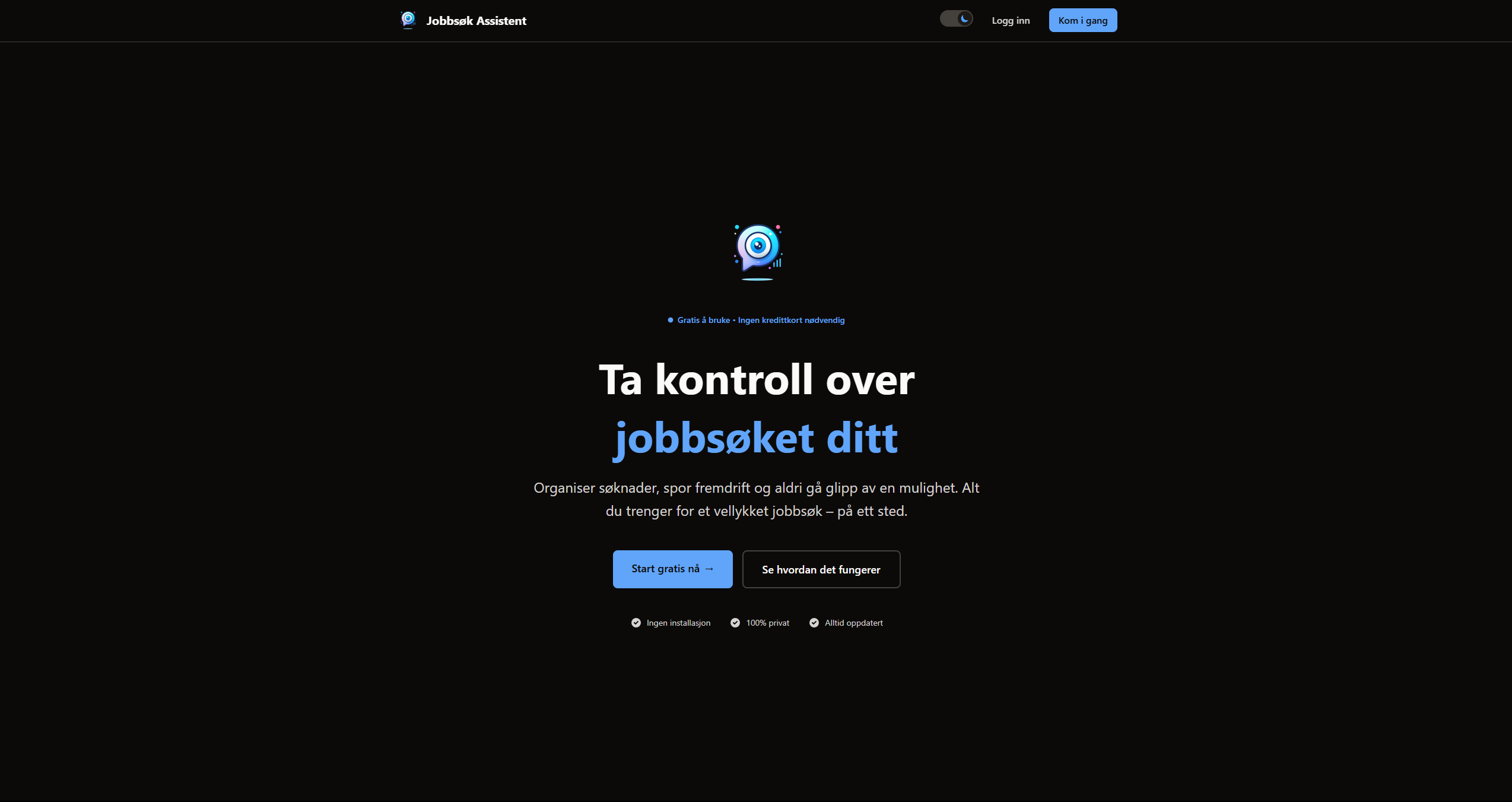
Three weeks ago, I started building a job search tracker. The goal was simple: help job seekers organize applications, track progress, and never miss an opportunity.
What started as a gray, functional prototype evolved into a professional, production-ready application. This is the story of that transformation — the technical decisions, design challenges, and lessons learned along the way.
🎯 The Problem#
Job searching is chaotic. You're juggling applications across multiple platforms, tracking deadlines in your head, and trying to remember which company you contacted last week. Spreadsheets help, but they're not exactly inspiring to use.
I wanted to build something better. Something that made the job search process feel less overwhelming and more manageable.
The Vision#
- Organized – All applications in one place
- Visual – Kanban board to see status at a glance
- Actionable – Never miss deadlines or follow-ups
- Personal – Full control over your data
- Professional – Clean, modern interface
🛠️ The Tech Stack#
I chose technologies I was comfortable with, but also wanted to push myself to learn new patterns and best practices.
Frontend#
- Next.js 16-React framework with App Router
- React 19 – Latest version with Server Components
- Tailwind CSS 4 – Utility-first styling
- TypeScript 5 – Type safety throughout
Backend#
- MongoDB Atlas – Cloud database
- Mongoose 8 – Object modeling
- Clerk – Authentication
- Vercel Blob – File storage
Key Libraries#
- Zod 3 – Schema validation
- React Hook Form 7 – Form handling
- @dnd-kit – Drag-and-drop
- date-fns – Date manipulation
Why These Choices?#
Mongoose over Prisma – Better native MongoDB support and more flexible for NoSQL patterns.
Server Actions over API routes – Less boilerplate, type-safe, and cleaner code.
Clerk over NextAuth – Easier setup, better UX out-of-the-box, no separate auth backend needed.
📊 The Journey: Four Development Sessions#
Session 1: Foundation#
The first session was all about getting the basics right:
- Set up Next.js 15 that turned into 16 shortly after release
- Connected MongoDB Atlas
- Implemented Clerk authentication
- Created 8 Mongoose schemas (User, Job, Task, Note, Document, Event, Contact, Analytics)
- Built basic CRUD operations with Server Actions
- Created initial UI (Header, Footer, Dashboard)
- Implemented basic Kanban board
Result: A functional MVP, but visually uninspiring. Everything was gray. Very gray.
Session 2: Documents Page Redesign#
I started with the Documents page because it was the simplest to tackle:
Added:
- Stats cards showing document counts by type
- Real-time search and filter functionality
- Modern grid layout instead of list view
- Improved empty states with helpful messages
- Better file upload experience
The Turning Point: This is where I discovered that small visual improvements make a huge difference. Adding icons, better spacing, and thoughtful empty states transformed the page from functional to friendly.
Session 3: Complete UI/UX Overhaul#
This was the big one. I went through every major component and gave it a modern redesign:
Job Detail Page – 5 Tabs:
- Notes – Modern card design with hover effects
- Tasks – Smart deadline visualization with color coding (overdue = red, soon = yellow, normal = blue)
- Contacts – Clickable mailto/tel links, avatar icons
- Files – Type-specific icons, action buttons
- Timeline – Vertical timeline with color-coded events
Job Form:
- Added 4 new fields (application date, deadline, salary checkbox, source dropdown)
- Organized into 6 logical sections
- Added helpful hints and placeholders
- Improved validation and error messages
Kanban Board:
- Redesigned layout for dashboard (8/12 + 4/12 grid)
- Added stats panel on the side
- Improved drag-and-drop with clear handle
- Better color coding for light mode
- Fixed hydration errors
CSV Manager:
- Created accordion help system with 4 tabs
- Added visual guides for Excel sheet creation
- Improved import/export UX
Session 4: Polish & Refinement#
The final session focused on details:
Dashboard Improvements:
- Next Tasks section with smart prioritization
- Recent Documents with gradient backgrounds
- Statistics cards with hover effects
- Better visual hierarchy
Contrast Fixes:
This was critical. The app looked great in dark mode but was hard to read in light mode. I went through every component and fixed text contrast to meet WCAG AA standards (4.5:1 ratio).
// Before (unreadable in light mode):
<h1 className="text-gray-400">Heading</h1>

// After (WCAG AA compliant):
<h1 className="text-gray-900 dark:text-gray-100">Heading</h1>
Logo Implementation:
- Replaced placeholder with actual logo
- Implemented across Header, Footer, Landing page
- Optimized with Next.js Image component
🎨 Design Philosophy#
Throughout the project, I followed a few key principles:
1. Modern & Clean#
Professional design that inspires trust. Rounded corners, subtle shadows, and plenty of whitespace.
2. User-Friendly#
Intuitive for both technical and non-technical users. Helpful error messages, tips where needed, and clear navigation.
3. Accessible#
WCAG AA compliant with 4.5:1 contrast ratio, keyboard navigation, focus states, and semantic HTML.
4. Responsive#
Mobile-first approach. Works on all screen sizes with touch-friendly targets (44x44px minimum).
5. Theme-Aware#
Perfect contrast in both light and dark mode. CSS variables for consistent styling and smooth transitions.
💡 Key Challenges & Solutions#
Challenge 1: Text Contrast in Light Mode#
Problem: Text was too light to read comfortably in light mode.
Solution: Used darker colors (gray-900, gray-800) for text in light mode while keeping lighter colors (gray-100, gray-200) for dark mode.
Result: WCAG AA compliant throughout the app.
Challenge 2: Kanban Board Layout#
Problem: The board looked cramped on the dashboard with stats taking up too much space.
Solution: Implemented a flexible layout system where the board can show stats inline on the /jobs page but hide them on the dashboard, using an 8/12 + 4/12 grid instead.
Result: Perfect balance between functionality and visual appeal.
Challenge 3: Hydration Errors#
Problem: Server-rendered HTML didn't match client-side React, causing hydration mismatches.
Solution: Added suppressHydrationWarning to the Kanban board container.
Result: Clean console, no errors.
Challenge 4: Drag-and-Drop UX#
Problem: Users didn't know what they could drag.
Solution: Added a clear drag handle (⋮⋮) with cursor changes and hover states.
Result: Intuitive drag-and-drop experience.
📈 By the Numbers#
- Development Time: 3 weeks (4 focused sessions)
- Components Created: 30+
- Server Actions: 45+
- Database Models: 8
- Features Implemented: 40+
- Lines of Code: ~6000+
- Documentation: 15+ markdown files
- TypeScript Coverage: 100%
- WCAG Compliance: AA
🚀 What I Learned#
1. Start Simple, Iterate Often#
The first version was gray and boring, but it worked. That foundation made it easier to add polish later. Don't wait for perfection before shipping.
2. Visual Design Matters#
Small improvements compound. Better spacing, thoughtful colors, and helpful empty states transformed the app from functional to delightful.
3. Accessibility is Not Optional#
Testing in both light and dark modes revealed contrast issues I wouldn't have caught otherwise. Always test with real users and real conditions.
4. Documentation Saves Time#
Writing comprehensive docs during development made it easy to pick up where I left off. Future me is grateful.
5. User Feedback is Gold#
Testing with actual job seekers revealed pain points I hadn't considered. Their input shaped features like the deadline color coding and CSV help system.
🔮 What's Next?#
The app is production-ready, but there's always room for improvement:
High Priority#
- UI polish (60+ tasks planned)
- Better drag-and-drop animations
- Undo functionality
- Bulk operations
Medium Priority#
- iCal feed for interviews
- Google Calendar sync
- Analytics dashboard
- Privacy settings
Low Priority#
- Email templates
- Auto-extract from job postings
- Smart suggestions
- PWA support
🎯 Try It Yourself#
Want to see the app in action? Check it out here:
🚀 Job Search Assistant - Live Demo
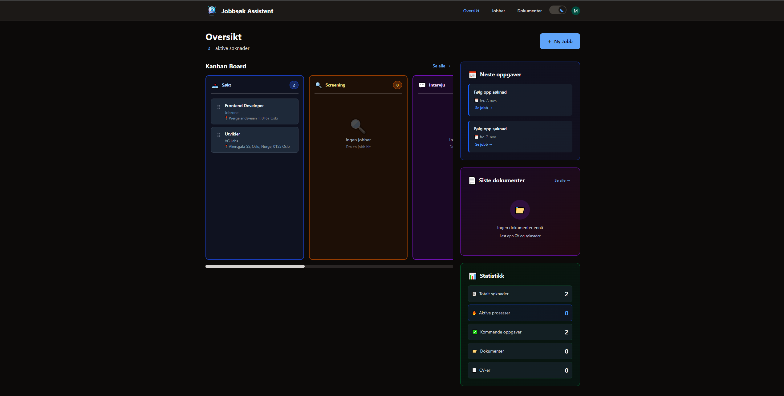
The app is fully functional and production-ready. Feel free to create an account and explore!
Key Features to Try:#
- Create and manage job applications
- Drag-and-drop Kanban board
- Upload documents (CV, cover letters)
- Track tasks and deadlines
- Manage contacts
- View statistics and analytics
- Toggle between light/dark mode
- Fully responsive on all devices
💭 Final Thoughts#
What started as a simple job tracker became a comprehensive application management system. The journey from gray prototype to polished product taught me valuable lessons about design, user experience, and the importance of iteration.
The key takeaway? Ship early, iterate often, and listen to users.
Building this app reminded me why I love web development. It's not just about writing code — it's about solving real problems for real people. And when you see someone use your app and say "this actually helps," that's when you know you've built something worthwhile.
Have you built a job search tracker? What features would you add? I'd love to hear your thoughts (once I implement that comment system... 😅)