From Project Angmar to MoBo Digital – A Branding Journey
From Project Angmar to MoBo Digital – A Branding Journey
October 24, 2025
Today marks a significant milestone for this portfolio – the transition from placeholder name "Project Angmar" to the official brand identity: MoBo Digital.
This wasn't just a simple find-and-replace operation. It involved rethinking the visual identity, refining the user experience, and ensuring every touchpoint reflected the new brand. Let me walk you through the journey.
🎨 The Logo Design Process#
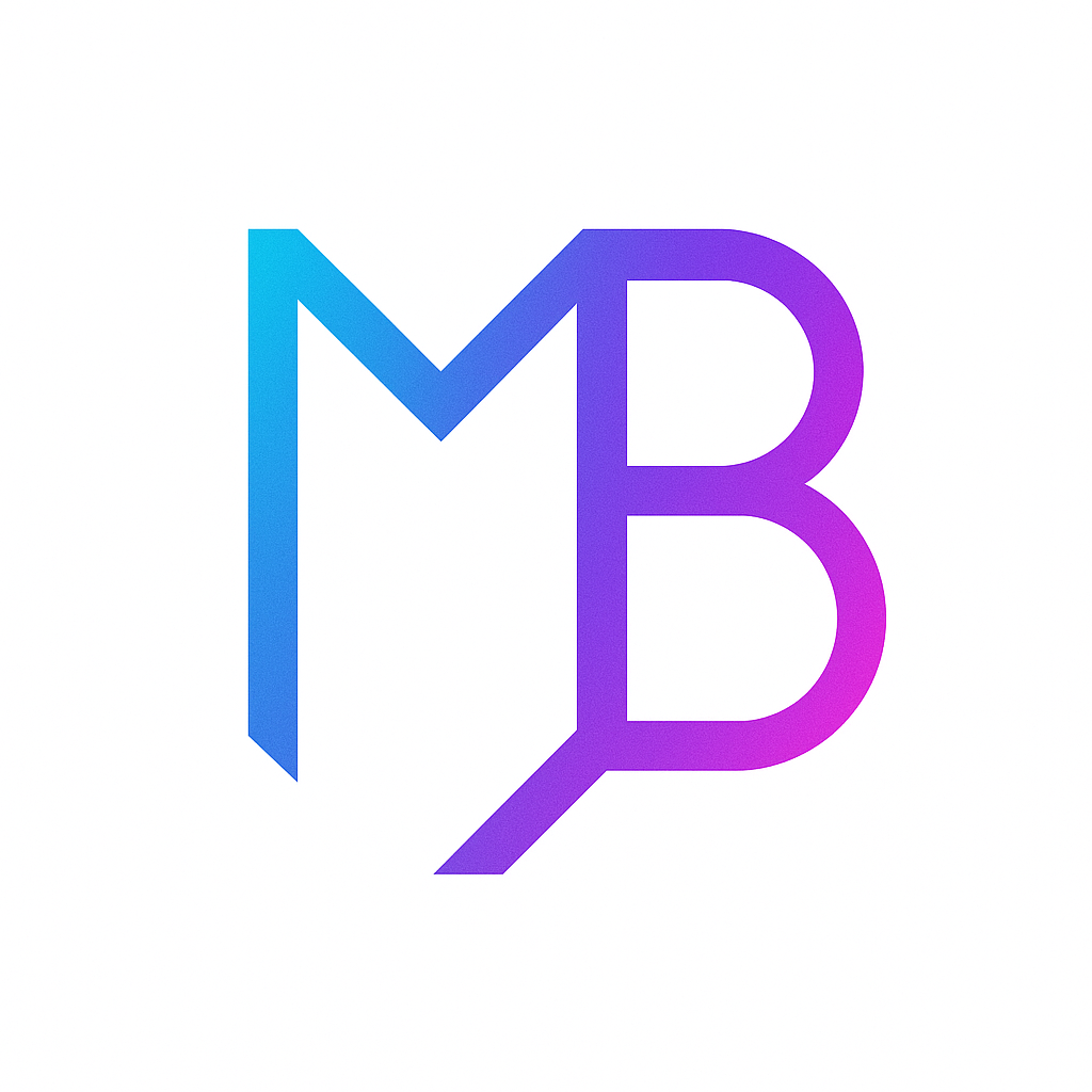
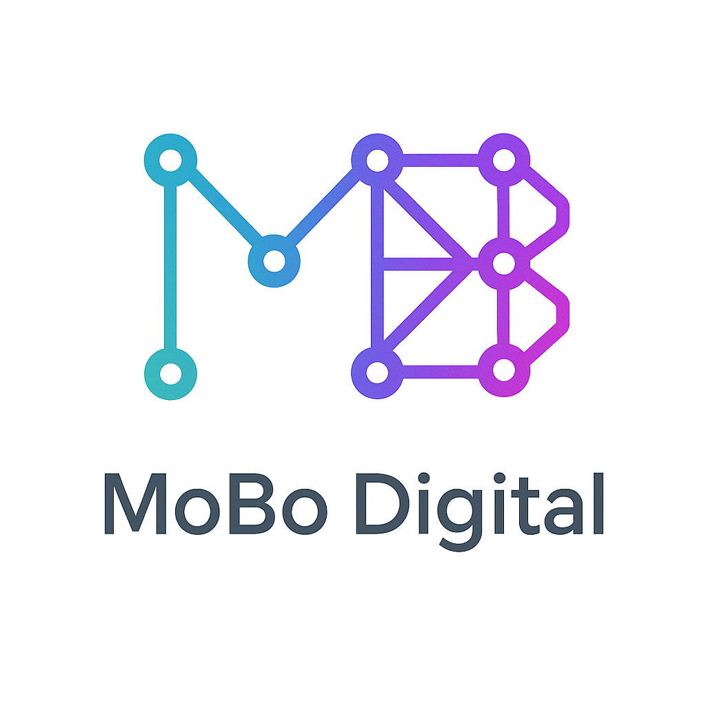
When it came time to create a logo, I knew I wanted something modern, tech-forward, and representative of my work. I generated 24 different logo concepts using DALL-E, each exploring different styles and approaches.
The Contenders#
Here's a selection of the logos I created:
Why Logo 14?#
After testing all 24 variations across different contexts (header, footer, mobile menu, light/dark themes), logo14 emerged as the clear winner. It's:
- Clean and modern – Works at any size
- Theme-agnostic – Looks great in both light and dark mode
- Memorable – Distinctive without being overly complex
- Professional – Strikes the right balance between creative and corporate
🏗️ The Technical Implementation#
Rebranding a portfolio isn't just about swapping out a name. Here's what went into making MoBo Digital a reality:
1. Brand Identity Update#
Updated every user-facing reference across:
- Header and footer components
- Page metadata and SEO tags
- OpenGraph and Twitter cards
- Blog post titles and descriptions
- URL structure (mobodigital.vercel.app)
2. Header Redesign#
The header needed to be more prominent to showcase the new logo:
// Before: 64px header with 32px logo
<div className="h-16">
  <img className="h-8 w-8" />
</div>

// After: 96px mobile, 112px desktop with 56-64px logo
<div className="h-24 md:h-28">
  <Image className="h-14 w-14 md:h-16 md:w-16" priority />
</div>
The larger header required recalibrating the Hero section to maintain the full-screen (100vh) design:
:root {
  --header-h: 96px; /* mobile */
}

@media (min-width: 768px) {
  :root {
    --header-h: 112px; /* desktop */
  }
}
3. Mobile Menu Overhaul#
The mobile menu was completely redesigned as a full-screen overlay with integrated controls:
Before:
- Opened only in header area
- Transparent background
- No theme/language controls
After:
- Full-screen overlay
- Solid background with blur effect
- Theme toggle (Sun/Moon)
- Language switcher (Globe)
- Centered navigation
🎯 UX Refinements#
Beyond branding, several UX issues were addressed:
Testimonials Layout#
The testimonials section had inconsistent card heights, creating visual chaos. Fixed with:
<figure className="flex h-full min-h-[320px] flex-col">
  <blockquote className="flex-1 line-clamp-6">
    {/* Text truncated at 6 lines */}
  </blockquote>
  <figcaption className="mt-auto">{/* Always anchored at bottom */}</figcaption>
</figure>
Hero Scroll Button#
The scroll-to-next-section button wasn't working on mobile. The fix involved:
- Proper z-indexing (
z-20) - Touch optimization (
touch-manipulation) - Adding the target element ID (
id="home-features") - Better centering with flexbox
Profile Image#
The About page profile image was cropped awkwardly. After testing object-top and object-contain, the solution was:
<Image className="object-cover object-[center_20%]" />
This positions the image 20% from the top, perfectly framing the face.
📝 Content Updates#
Added two new blog posts documenting recent experiences:
- Tech Fair Report – Honest review of Horten Tech Fair and Drammen Job Fair
- Prague Reflection – Thoughts on taking breaks and project roadmap
Both posts are fully translated and integrated into the blog system.
🚀 Performance Improvements#
Migrated all logo instances from <img> to Next.js <Image> component:
- Automatic image optimization
- Lazy loading for below-fold images
- Improved LCP (Largest Contentful Paint)
- Reduced bandwidth usage
📊 By the Numbers#
- Files Modified: 15+
- Components Updated: 8
- Issues Resolved: 10
- Lines Changed: ~500+
- Logo Variations Created: 24
- Time Spent: ~3 hours
🔮 What's Next?#
With the branding solidified, the focus shifts to functionality:
Immediate Priorities#
- Resume Section – Build web-based CV with PDF export
- Contact Form – Implement functional form with validation
- Mobile Polish – Further touch target improvements
Medium-term Goals#
- Performance Audit – Optimize images and bundle size
- Accessibility Review – WCAG compliance check
- Content Expansion – More blog posts and case studies
💭 Lessons Learned#
1. Branding Takes Time#
Creating 24 logo variations might seem excessive, but it was worth it. Seeing all options side-by-side made the right choice obvious.
2. Test in Context#
A logo that looks great in isolation might not work in your header. Always test in real-world scenarios across different themes and screen sizes.
3. Consistency is Key#
Updating the brand name in one place but forgetting another creates a disjointed experience. A systematic approach (grep search + checklist) ensures nothing is missed.
4. Mobile First, Always#
Several issues only appeared on mobile (scroll button, menu overlay). Testing on actual devices is non-negotiable.
🎉 Conclusion#
MoBo Digital is no longer just a placeholder name – it's a brand with a visual identity, consistent styling, and a clear direction. The portfolio is now ~25% complete, with solid foundations for the resume and contact sections coming next.
The transition from Project Angmar to MoBo Digital represents more than a name change. It's a commitment to building something professional, polished, and production-ready.
Here's to the next milestone. 🚀
What do you think of the logo? Have you gone through a similar branding process? I'd love to hear your thoughts (once I implement that comment system... 😅)